Back in 2017, I wrote about Some Scrappy Art I Probably Won’t Be Buying. It consisted of several production drawings that someone was trying to sell on eBay, with a minimum bid of $499 per piece. That was way too rich for even my Scrappy-loving blood.
Fast forward to 2021. Another someone is selling drawings of Scrappy (and other Screen Gems characters) on eBay, clearly from the same stash as the 2017 ones. This time, however, the asking price isn’t just reasonable–it’s dirt cheap for vintage animation art. (In fact, it’s roughly what the sales tax would have been for the 2017 ones.) So I bought some. After all, original Scrappy art of any kind is rare stuff.
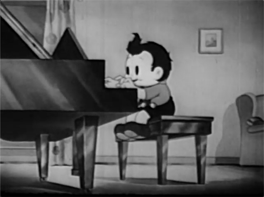
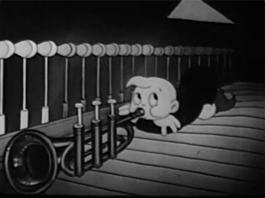
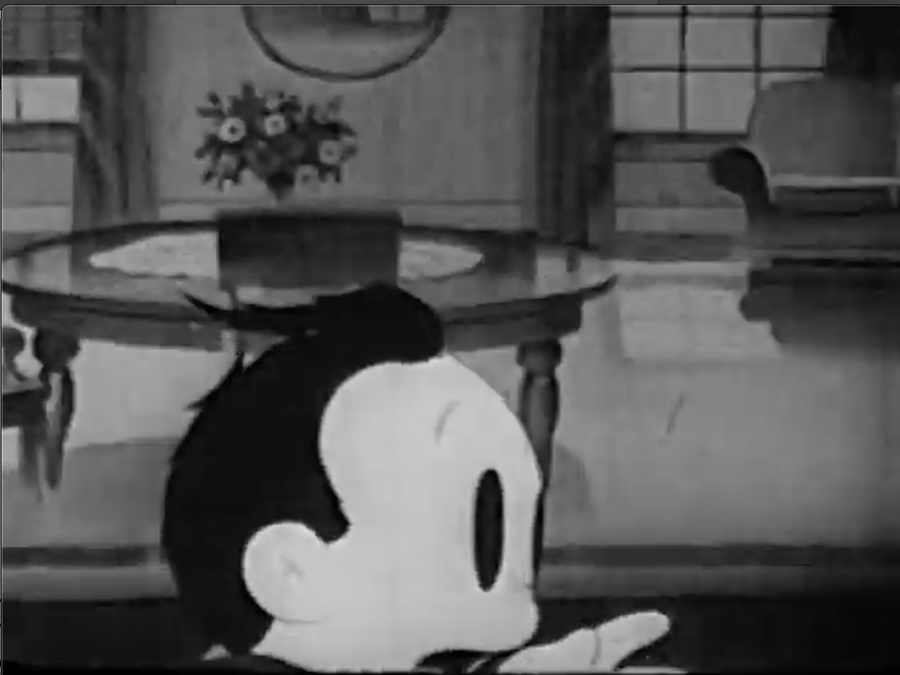
Thanks to Jerry Beck, I now know that all of these drawings are from Practice Makes Perfect, a 1940 Screen Gem that was–depending on how you count–either the seventh or sixth next-to-last Scrappy cartoon. I’m not sure who did this art (or if it’s all by one person), but the credited animators on the short are Harry Love and Peter Falk’s pal Lou Lilly. Herewith, highlights of the art I bought, plus (as best I can tell) the corresponding frames from the finished product.
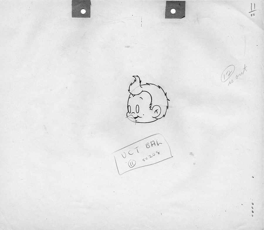
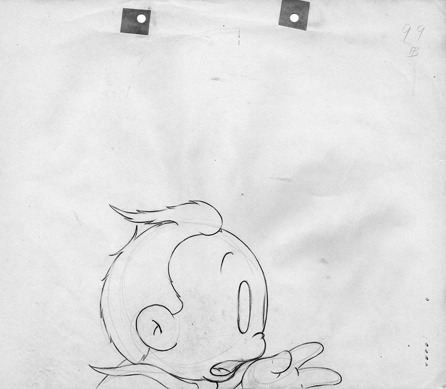
Scrappy looks like at least two different characters in different portions of this film, but in all cases he’s been redesigned to suit the animation industry’s tastes of the late 1930s, which were considerably more ornate and pseudo-realistic than when the Scrappy series started in 1931. The way Scrappy is drawn with a fastidiously ragged cowlick reminds me of how modern computer animators obsess over details like the pores in Mr. Peabody’s nose.
I’m intrigued by the notes on these drawings and wonder what stuff like “UCT BAL” means. Maybe any animators out there reading this can fill me in. Also interesting: The peg holes on all these drawings have been reinforced with bits of heavier paper, seemingly by hand.
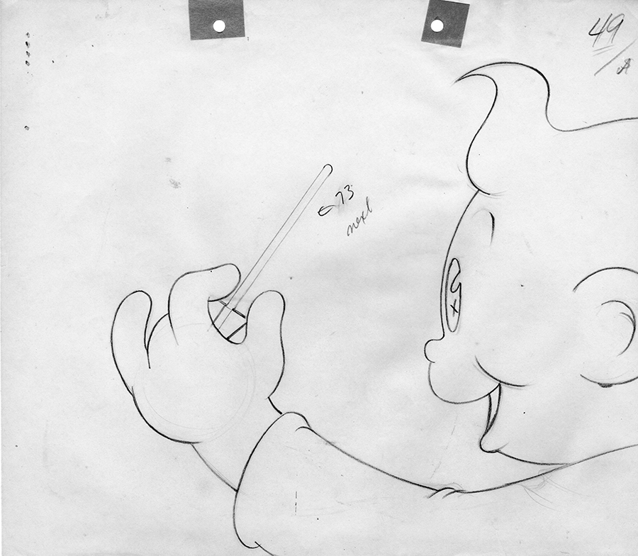
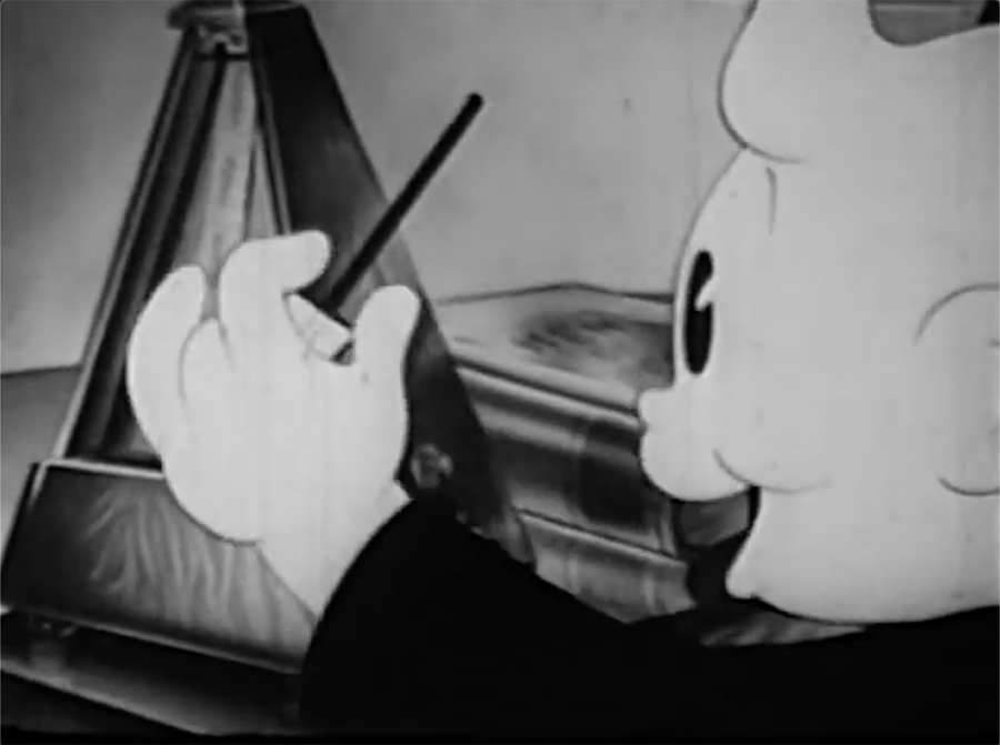
Most of the cartoon is devoted to gags involving Oopy interfering with Scrappy’s piano practice. He too has been given a vaguely Fred Moore-esque redesign. This drawing looks like he’s conducting, but he’s actually messing around with Scrappy’s metronome.
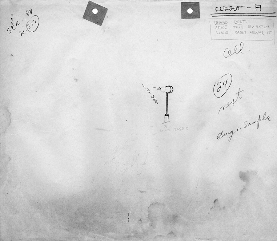
Here’s a hammer from inside the piano (inevitably, Oopy has climbed inside it for the sake of a gag) with a note to the BKGRD DEPT on making it match the other ones. What does “CUT OUT” mean, and is it relevant that it’s crossed out?
Scrappy in close up, also with elaborate hair. Whoever drew this started with some construction lines in red pencil.
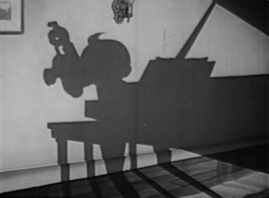
Like Mickey Mouse–and most good cartoon characters in general–Scrappy is instantly identifiable in silhouette, or would be if people remembered him. Here he’s holding his pup–is he a redesigned Yippy?–by the tail.
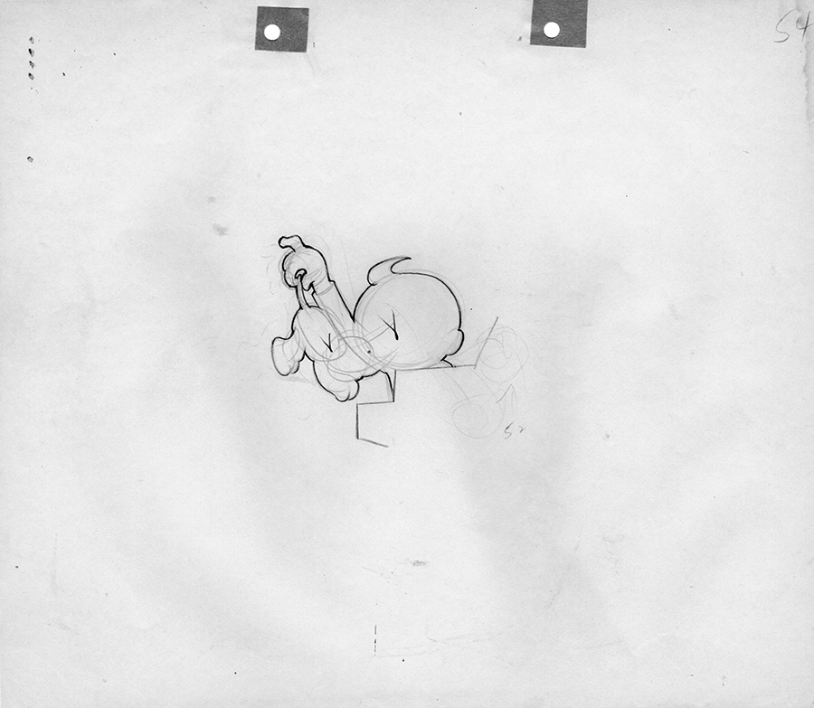
Rather than being Scrappy at his best, Practice Makes Perfect is a bland. unfunny remnant of his decline and fall. Still, I’m glad to own these drawings. It’s fun to think about someone sitting at an animation desk making them at 7000 Santa Monica or 861 Seward (or possibly both: the studio moved in 1940, but I’m not sure exactly when).
Here’s the short in its entirety. Don’t you agree that YouTube’s single greatest contribution to society has probably been making it easier to watch long-unwatched Scrappy cartoons?

What a fantastic find! Are you bidding? Do you have the eBay item numbers available? I’d like to check it out!
Hi, Peter. Here’s the eBay listing:
https://www.ebay.com/itm/224397768829?hash=item343f26387d:g:rzIAAOSwIQBgWn~w
Note that the seller is selling lots of four drawings for $80 per lot (or less if you buy more than one lot) and has seven lots left. He picks the exact drawings you’re going to get, so it’s a bit of a gamble. But when I bought two lots, he sent me an extra four drawings for free, for a cost of $12.66 per drawing. This stuff is a great bargain for 81-year-old animation art.
Hi Harry,
The “UCT Bal” means to trace the balance of the drawing #11 from sc. 208. This gives instructions to the inker to combine the drawings, thus saving cel levels. The drawing of the hammer from inside the piano was probably labelled “cut-out” to indicate that the hammer was to be rendered on a piece of bristol board, cut out and attached to the background. This also would have saved a cel level. “Cut-Out” is probably lined out because the production planner changed his/her mind and had the hammer traced on a cel after all.
Thank you, Mark. I knew you’d know.
It’s good that these are finding their way into the proper hands at last.
Good
Amazing article, Thanks for this wonderful information.